
When searching for online tools to complete a task, you’re eventually going to come across something with Google’s fingerprints on it. Data visualization is no exception, with Google Charts being Google’s answer to this growing interest.
Like with D3, charts are rendered in your browser using HTML and SVG. Unlike D3, however, you don’t have to build everything from scratch. Google Charts gives you a fairly large, pre-built set to work with; all you have to do is provide the data.
In a nutshell, using Google Charts can be broken down into four main steps:
- Load the Google Visualization API into your HTML file. This can only be done once, but you can load as many packages as you need when doing so.
- Create a data set. This is done using the Visualization API’s DataTable class. DataTable is a two dimensional table: columns define data type (e.g., string, number, etc.) and data labels, and rows define the actual data. Data in each column must be the same data type.
- Draw the chart. This is done through the API’s draw() method. This method takes two values: your DataTable, and customizable chart options. The options piece is not required, but can be used to customize charts if you want to change the default colors, add a title, or specify the chart’s size.
- Create an HTML element (typically a <div> tag) to hold your chart.
To see all this in action, copy and paste the following code into an HTML file. Once saved, you won’t need a Web server to view it; you can just open the file.
<html>
<head>

<!--Load the AJAX API-->
<script type="text/javascript" src="https://www.gstatic.com/charts/loader.js"></script>
<script type="text/javascript">

// Load the Visualization API and the corechart package.
google.charts.load('current', {'packages':['corechart']});

// Set a callback to run when the Google Visualization API is loaded.
google.charts.setOnLoadCallback(drawChart);

// Callback that creates and populates a data table,
// instantiates the pie chart, passes in the data and
// draws it.
function drawChart() {

// Create the data table.
var data = new google.visualization.DataTable();
data.addColumn('string', 'Topping');
data.addColumn('number', 'Slices');
data.addRows([
['Mushrooms', 3],
['Onions', 1],
['Olives', 1],
['Zucchini', 1],
['Pepperoni', 2]
]);

// Set chart options
var options = {'title':'How Much Pizza I Ate Last Night',
'width':400, 'height':300};

// Instantiate and draw our chart, passing in some options.
var chart = new google.visualization.PieChart(document.getElementById('chart_div'));

chart.draw(data, options);
}
</script>
</head>

<body>
<!--Div that will hold the pie chart-->
<div id="chart_div"></div>
</body>
</html>
Code taken from https://developers.google.com/chart/interactive/docs/quick_start
Here’s the result that appears when viewing the file.

Here are a few additional notes about the above code. We used the corechart package, which includes the following charts:
- Bar
- Column
- Line
- Area
- Stepped area
- Bubble
- Pie
- Donut
- Combo
- Candlestick
- Histogram
- Scatter charts
In other words, this will cover you in most cases. However, there are other packages to choose from. To see a full list of charts and what packages are required to use them, click here, and check out the documentation for each chart type.
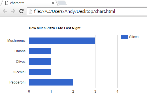
Switching between charts is easy. Suppose you want to use a bar chart instead. To do so, go to the above code, and replace
google.visualization.PieChart(document.getElementById('chart_div'));
with
google.visualization.BarChart(document.getElementById('chart_div'));.
To avoid truncating “slices” in the legend, also change the ‘width’ in your options variable from 400 to 500. Here’s the result.
And that’s it! As you can see, you may need to slightly change the display, but no need to specially tailor your DataTable when switching between charts.
Final Thoughts
Google Charts offers plenty of basic charts that will meet most visualization needs. While its customization isn’t as robust as D3 and Flex, it’s easier to learn, and building charts and graphs is much quicker. All in all, Google Charts is a good solution for simple visualization that doesn’t require too much customizing.
There’s more than what I’ve discussed in this post, so if you’re interested in learning more, click here.
References
Charts. (n.d.). In Google Developers. Retrieved March 2, 2016, from https://developers.google.com/chart/
Sumanth, K. (2014, September 11). D3.js v/s Google Charts: A Data Scientist’s Review. In Socialcops. Retrieved March 4, 2016, from http://blog.socialcops.com/engineering/d3-js-versus-google-charts

I really like the simplicity of google charts compare to D3.js since you can just call the graph, enter the data on a table format, customize it and create a visual. In addition, I like the fact that there is no need to know too much about coding which make it easier for professionals with basic knowledge of coding. As you mentioned, I also find Google Charts a straight forward tool that allow users to create quick and simple visualization charts. Thank you for the information Andy, I really enjoyed reading your post.
LikeLike
Thanks Jose. As you say, I think the most appealing thing about this API is that even those with a basic knowledge of coding can use it effectively if they play their cards right: just save a template, and modify a few lines as needed!
LikeLike
Andy, you did it again! Great post!! I actually ran the code you were nice enough to give and it was super easy, thank you! I knew nothing about Google charts and now can’t wait to have an occasion to use them. And a special thanks for the cautionary advice!
LikeLike
Thanks Pat!
LikeLike
Google chart is of the simplest visualization tool out there. The simplicity and customizable option makes it must have tool . Also, it can integrated with other services and API.
LikeLike
Great post. I recently started using Google Charts. Like other have commented, Google charts is quite easy to use and can be implemented quickly. I also find it to be a good introduction in the space of data visualization within a web application.
LikeLike